In this series of blog posts, I will talk about my process as a producer, designer, and programmer of Real Al’s Humanity Academy. I’ll discuss why I made the decisions I did in each of these roles to give readers a better idea of how I approach these disciplines. The intended audience of these posts are potential employers, collaborators, and/or fans of the game who want a more behind-the-scenes look.
In this post, I will discuss how our team designed the project’s game mechanics.
In the previous posts, I discussed why our team set out to make a VR party game and why we thought a minigame collection was the best fit for our team.
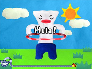
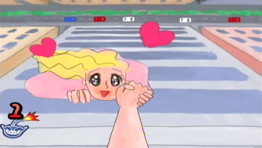
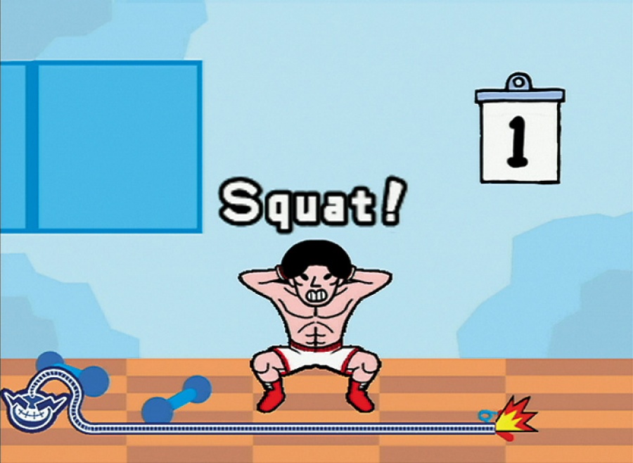
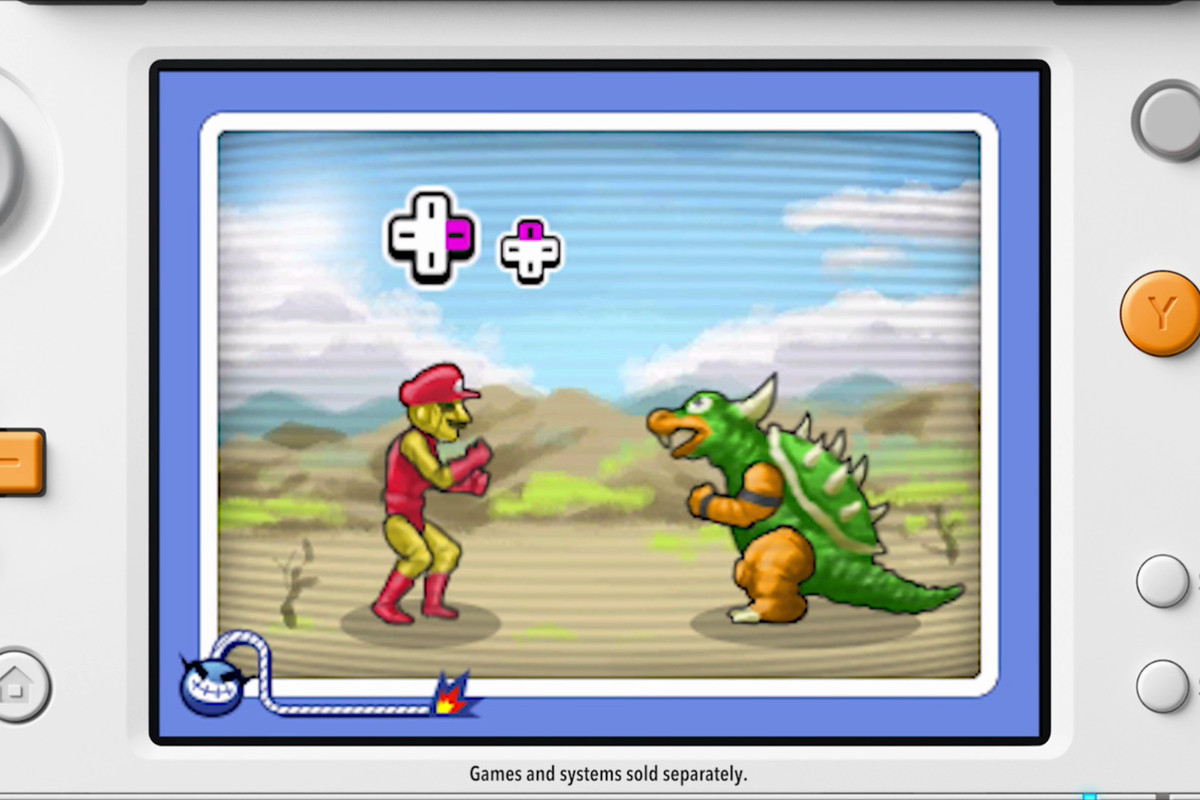
With our gameplay concept selected, we brainstormed individual gameplay mechanics. As in Warioware or Dumb Ways to Die, each minigame would be based around a simple mechanic. When the game progressed, the minigames would become increasingly complex and difficult.
The Dumb Ways to Die minigame collection was another source of inspiration for our game.
A core principle that we kept in mind throughout this process was to design every minigame for VR and only VR. At that time, there were many VR titles on the market that were essentially 2D experiences shoehorned into the medium. We wanted to make something that could only be experienced in VR and that utilized VR’s strengths, such as its physicality and 360 degree environments.
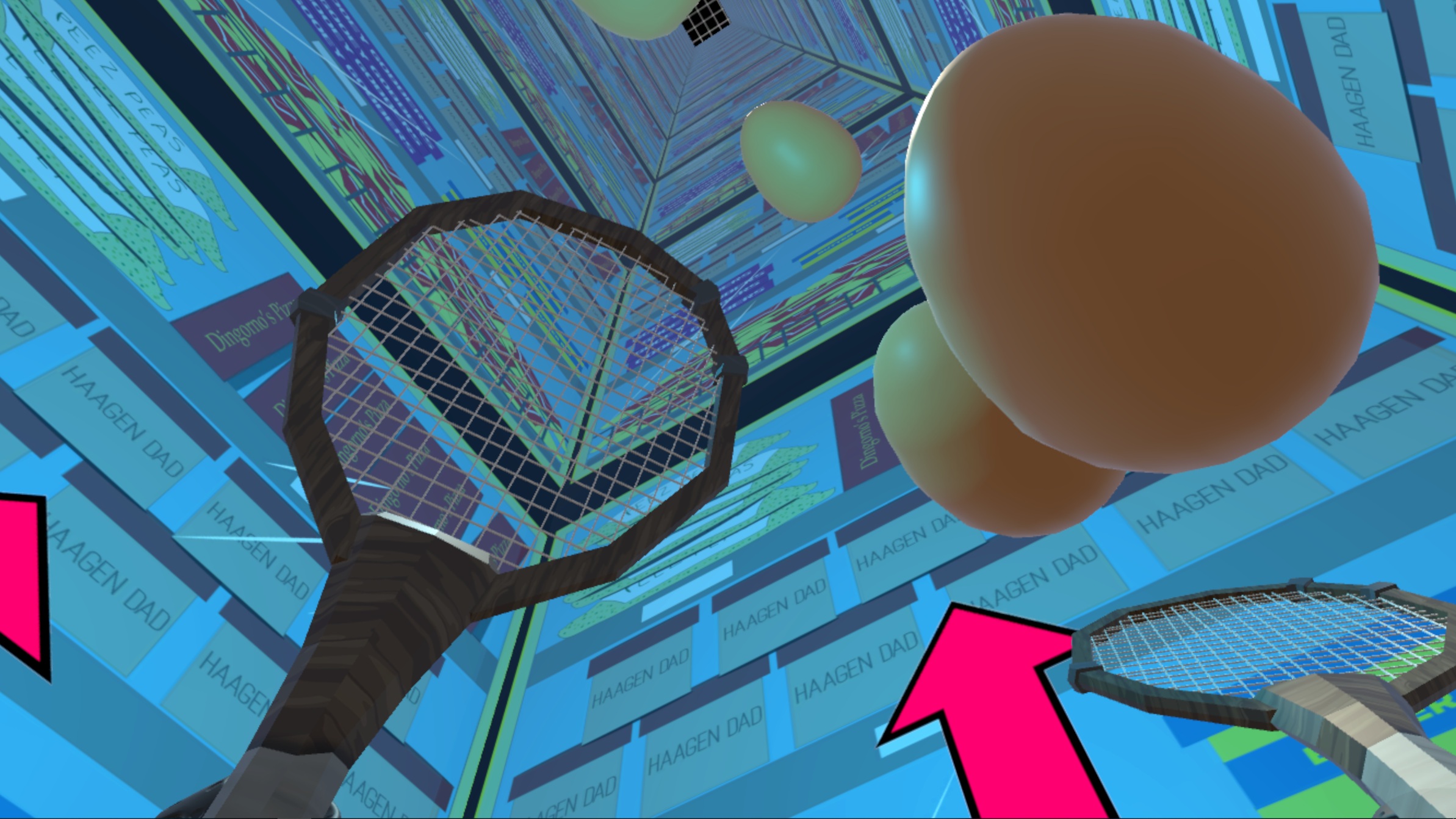
One of my favorite aspects of VR is its physicality. Like the Wii remotes before them, the HTC Vive’s motion controllers feel fantastic when you use them to perform physical tasks like swinging tennis rackets, boxing heavyweights, or climbing mountains. To brainstorm minigame ideas, I would grab a Vive controller and play with it like a toy until I found a motion that I found satisfying. Then, I would try to spin this action in a surprising way. For our “Bounce the Eggs” minigame, I first started with the motion of hitting a tennis ball. At that point, I prototyped surreal variants of this action, like the balls transforming into balloons on impact or the balls shooting out from the floor. Somehow, we arrived at eggs falling from the sky in a supermarket.
Our “Bounce the Eggs” minigame in action.
Another aspect of VR that I loved was the fact you could build a game all around the player. There’s something magical about turning around while in VR and finding a whole new side of the environment for you to explore. We applied this thinking to our game by designing every minigame so that you had to turn around and explore your environment to win.
Early in my time at NYU, I went to a VR masterclass that had Saschka Unseld, the director of Oculus Story Studio, in attendance. He said:
Film is about showing, not telling.
VR is about discovering, not showing.
I found this statement to be true in my time as a VR consumer and we tried to apply this paradigm to our design of the minigames. Imagine that each level is divided into a north, east, south, and west quadrant. Whenever it was possible, we tried to put a compelling and unique gameplay or art element in each quadrant so that the player would always feel rewarded when they turned around.
The “Grab the Numbers” minigame forced players to turn around because the numbers they needed were sometimes behind them.
I loved this phase of production because our team had the chance to experiment. We made minigames where you popped balloons, smashed computers, played blackjack with floating cards, and dodged evil bees.
To externally validate these designs, we were constantly playtesting our ideas. In order to expedite playtesting, I would parameterize the settings of the various minigames and then have playtesters try variants of the same minigame one after the other until they felt just right. For the egg bouncing minigame, I would modify the eggs’ speed, size, color, and sound effects until every bounce felt satisfying and fair. This method of iteration was one of my favorite parts of the process.
Sometimes, the minigames would get stuck even after several rounds of tweaking. When this happened, we’d review our playtest notes for a diagnosis. Most of the time, the issue was that the minigame was too complicated to understand in five seconds. When this happened, we identified the best part of the minigame and simplified or eliminated the rest. In one case, we had a minigame in which you had to use a flashlight to find a lever in the dark and then pull that lever. Playtesters didn’t like the minigame, but they did like the flashlight, so we kept the flashlight and redesigned the game around finding ghosts in a dark room.
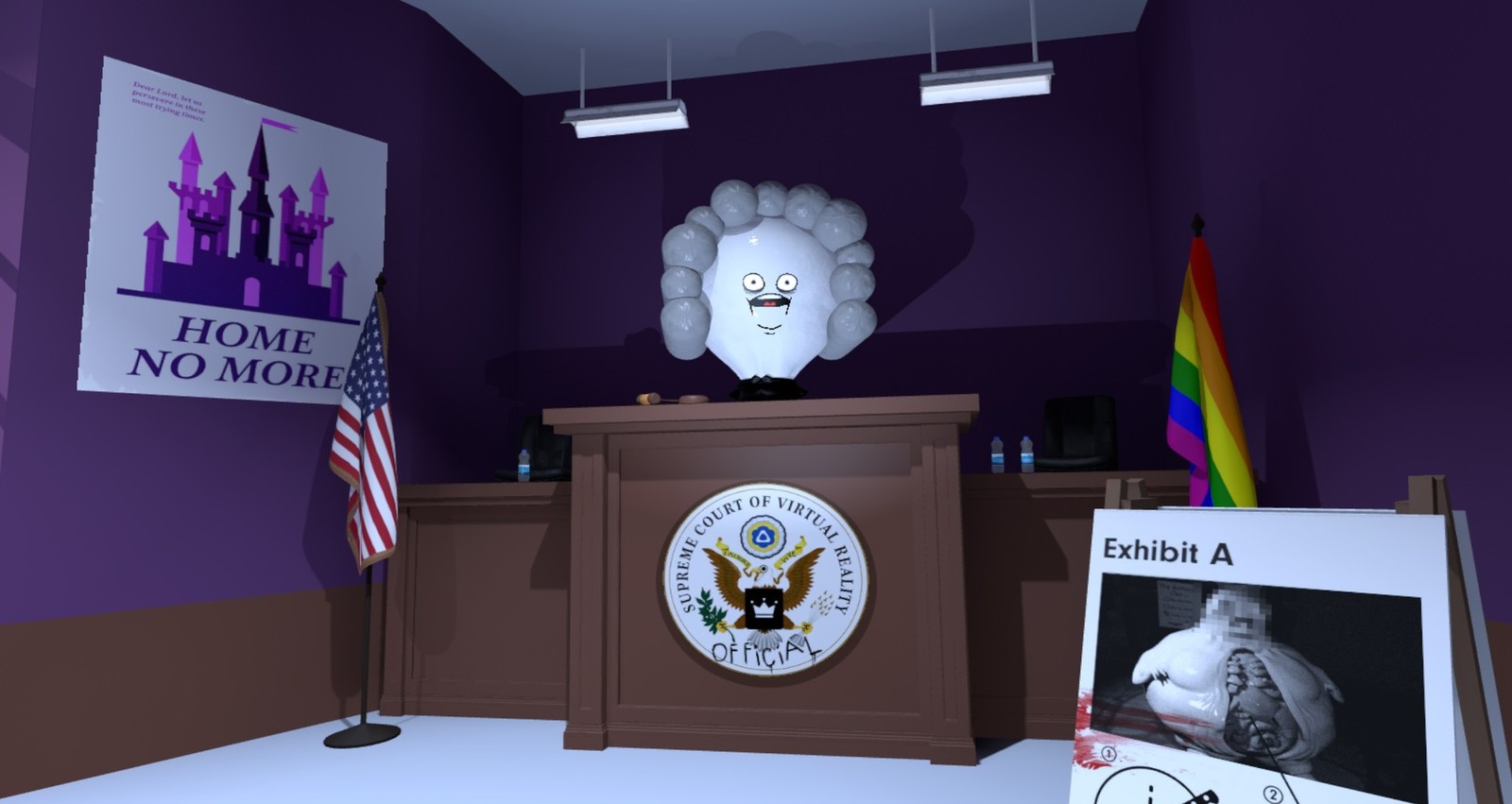
Players loved our flashlight mechanic, but not the rest of the minigame, so we kept the flashlights and ditched the rest. To make the flashlights even more rewarding, we added about forty unique images to the walls of the flashlight level so that players would be encouraged to explore the room.
When designing minigames, we found that a few guidelines generally held true. We measured our minigames’ success by two simple metrics: A) Did they want to play again? B) Did they say they liked the game? In general, we listened to “A” a lot more than “B!”
Simpler minigames performed better. Every minigame that required two phases ultimately became a one phase game.
Minigames that heavily utilized motion controllers performed better.
Minigames that gave dramatic reactions to the player’s actions performed better, regardless of whether the player won or loss. [For most players, a dramatic failure is more satisfying than a tepid victory.]
Minigames that forced the player to utilize all 360 degrees of an environment performed better.
Minigames that asked the player to simply touch an object were not as satisfying as minigames that required “bigger” actions like swinging, punching, or throwing.
For most players, the game felt well balanced and fair when they won about 75% of the minigames in the first round and won about 50% in the later rounds.
Players appreciated failure the most when they could clearly see how close they were to success. I think the egg game was popular in part to the fact that you could clearly see how many eggs were left to bounce at any given time. On other hand, I felt that the ghost game was sometimes unsatisfying because you could easily feel like you had made no progress if you didn’t spot any ghosts.
A progress bar from the amazing Cuphead. Players love to see how close they are to success.
At this point, we kept the game’s art and theming to a minimum. We wanted to to communicate the game’s general tone, but we did not want to finalize art assets until we knew that our game mechanics were solid. In general, we thought it would be easier to create a story around a set of mechanics than vice versa. I also didn’t want our team’s artists to spend time building assets for a mechanic that would ultimately be cut.
We knew from playtests that many players enjoyed taking turns playing the game with their friends. While this was great, we needed to give players a reason to invite others to play the game with them, so we implemented a simple local high score system. Putting a leaderboard in a game can awaken players’ competitive spirits; we found that most players would do an additional playthrough if they were aware of the leaderboard and were in the presence of their friends.
The final big test of our game’s mechanics that semester was the NYU Game Center’s biannual show. This was an important show for us because the show often had professional game designers in attendance.
The NYU Game Center, where this game was first designed.
Thankfully, the game was well received; several people even said the game was terrific. Most importantly, the game seemed to achieve its stated mission: it thrived in the show’s party-like atmosphere. Many people would first play the game individually then challenge their friends to beat their high scores. For me, this was a profound moment. We had built the foundation of a solid VR party game.
However, there was still significant work to do; the minigames needed refinement and the game lacked a theme. In my next post, I will discuss how I wrote the game’s script and how our team approached the game’s art.

